Accessibility at Virginia Tech Carilion School of Medicine
Video Transcript
[0:00] [Jamie Hollimion]: So Vianne, you are up.
Vianne Greek, CPWA, MBA
Web & Social Media Manager
[0:10] This is going to be a little scary because I have a 40 minute presentation that we're going to try and do in a whole 20 minutes. So we'll see how we do. So I am Vianne Greek and I am the web and social media manager here at school of medicine. My goal today is to teach you a little bit about accessibility. Obviously, we're not gonna be able to do a heck of a lot with it today, but I'll try and do my best to… I’m not seeing my people. Right.
[0:45] We're going to get a basic overview of accessibility and takeaways and tips anytime that you see this yellow light bulb, take a note, and those are some of the tips that I’m going to be sharing.
[1:05] Accessibility is the concept of whether a product and service is usable by everyone however they encounter it. And that's for me an important piece. We want to be sure that everybody can access whatever we're providing for folks. Accessibility is for all. It is not just for people with disabilities. It's about making content accessible for all audiences.
[1:29] So here are some things that we're doing here at the School of Medicine. We are focusing on making sure that videos have captions and transcripts, that we caption all of our events that are online, that we have color contrast, alternative text images, using meaningful links and doing text emails instead of PDFs and doing some more training.
[1:55] So let’s talk through each of these and I'll try and goes quickly as I can, but still stop to get some items here as well.
[2:03] So the video captions, it's really important for those obviously who are deaf and hearing impaired, but also those who prefer visual content, or those for whom English is a second language. And anyone who's in a noisy environment. And so as always as a tip, I would say at the very least, turn on captioning in Zoom meetings so anybody can do that.
[2:27] And some of us work at home. Sometimes the husband decides to do some lawnmowing in the middle of a meeting. So it's great to have those transcripts available for those kinds of times. Of course I have to shut the door as well. But that is always helpful or when you're not trying to disturb a baby. My stepdaughter just had a baby. So that's top of mind for me right now. Also, just for people who like visual and audio at the same time, 52% of students said that captions help them as a learning aid by improving comprehension because they were with the audio and the the written at the same time. I tend to do that as well when I am watching videos, I tend to do the captions while I am listening. It helps me with my comprehension.
[3:11] Right here at Virginia Tech, we have three ways of getting captions. The first one is anything with Zoom and Kaltura link, those are all free, they're automated. There's about 84 to 94% accuracy on that.
Professional captioning as a higher accuracy ratehierarchy. Captioning has higher accuracy and you can order them after the event. And so if you have recorded and what you want to do with the video, like we've done that with the black medicine one and the neurodiversity. We had that going through there as well. And they're free for many courses and community events. So we can, and the links to order them are on the slide that we will send out.
[3:58] Live captioning is only available for certain types of events and there are conditions that apply, an our IT department are the ones that order those.
[4:10] One thing to note is that the audio quality does matter. The better the source audio, the better the quality of the captions. And even though he's not here anymore, I want to do a quick shout out to Dean Learman, for always speaking slowly and enunciating well. Whenever he does presentations, there are very few captions that we have to fix so kudos to Dean Learman for that.
Resources for Captioning
- Zoom - free but requires manually turning it on
- Kaltura (video.vt.edu) - free and automated for all videos
- Accessible Technologies: Captioning
- Accessible Technologies: Post Production Captioning
- Accessible Technologies: Live Captioning
[4:31] Here's a fun activity and I'll ask you to unmute or put in the chat. What you think answers are. Here on the left we have what the edits with the automated captions provided. My Bavarian infant pudding ceremonies doubtfully trained. We got mad at them, and Ronald. So either speak up or put in the chat what you think answers are for these, what are the correct captions for these five words and phrases?
[5:17] Yeah, we're guessing correctly. So pudding ceremonies, is hooding ceremonies. Good. Guess. Leslie. Thoughtfully trained could be good. Carilion Clinic is in this one. Yeah. Look at that. So what it turned out to be: is my very own family. My Bavarian infant, pudding ceremonies was hooding ceremonies, doubtfully trained was doctorally trained. That's a little dubious if you have that incorrect. we got mad at that was we’ve got medicine and Ronald was Roanoke. So it's important that we check these. Some of these came from Dr. Vari’s retirement party and my Bavarian infant, Was Dustin saying that.
[6:16] On this next slide, I have the logo here of the Virginia Tech Carilion School of Medicine. And these are some of the captions that have come up. You have the Brilliant School of Medicine, the Korean School of Medicine, Corinthian School of Medicine, and Krillian. But what we definitely don't want is the Virginia Tech Ruined School of Medicine. And that was one that came up in a recent one. So this is one of the reasons we always want to review and edit your captions or transcripts.
[6:45] I like to put transcripts on everything I do and for any training items that are available to the public. And it is essential for those who are both deaf and blind as the only way they have of reading is through a braille machine, so it's important that they always have the text equivalent. It's also good for people who prefer we reading versus listening. It's quicker to scan and find content when you have transcripts. It's faster to pull quotes since you can just copy and paste and they are searchable. So if you're looking for something specific that was said in a presentation, you can find it very easily if you do a search.
[7:27] I go a little bit too far maybe when I do the taskforce updates I provide the transcript with the slides and I put alternative text on the slides as well. But I do that partly because if we’re looking at a full presentation, it's a lot of scrolling through text, so I break it up with the images.
[7:45] Contrast is another important item. It improves readability for all, and it is essentially for those who are visually impaired or colored blindness. And so what is color contrast? It is the difference between difference in brightness between foreground and background colors. And you can see here on the left, you've got dark and black. And then the next one, the next one mix and can go lighter and lighter and lighter boxes to a very light gray which does not have much contrast to the white. So where that is important is when we have the contrasts requirements. So our colors don't go together, the maroon and orange just don't work very well. We have a minimum contrast ratio requirement of 3:1 for headings and 4.5:1 for body text. And so what we recommend is you always use white with our colors so that it has sufficient contrast if we're using our colors as a background.
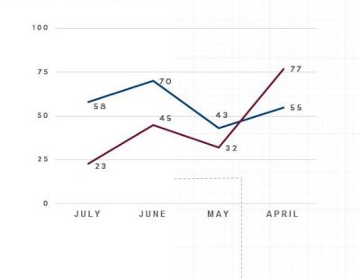
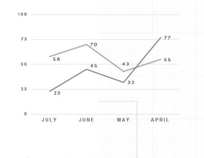
[8:46] The next slide is about graphs. And when you create graphs that do not rely on color alone. People with colorblindness won't be able to see the difference in hues between maroon and blue. So what often you can see is just black and white. Sometimes people see in monochrome, so it'll be black and white anyway with some with color issues you can see this is almost the same color or contrast.
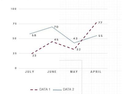
[9:23] If you're going to do graphs it can be helpful to have different shapes as well as color. So in this case, the colors I did not change and you can see there's a dotted line on one graph and then the other line has dashes. So it's a little more easy for people to see. If they were to see this in black, white.
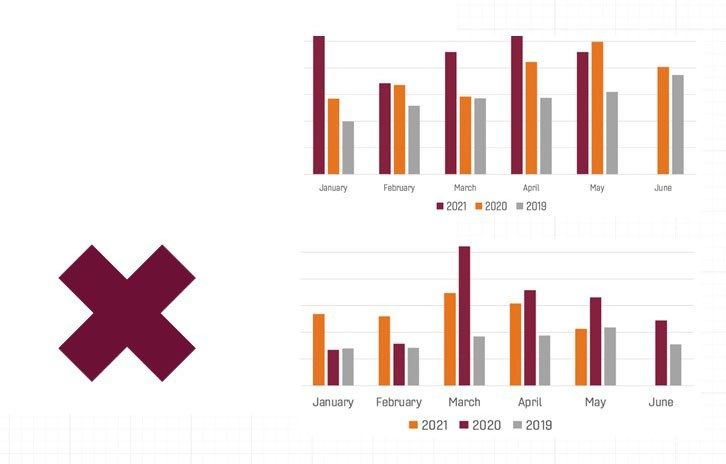
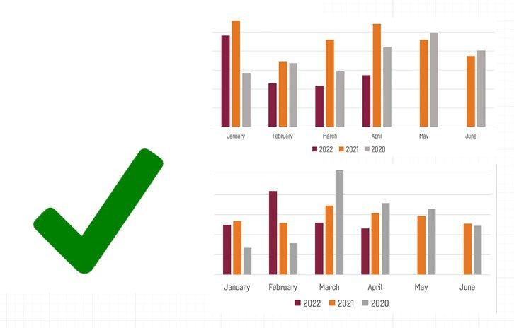
[9:44] Consistency. This is a big one for me. I like to see things the same. And this was actually an example from Virginia Tech statistics. They send out a monthly e-mail with charts. And it was confusing me to see 2021 be different colors in both graphs. And so this is also one of those things that if you're used to seeing things a certain way, this helps everybody because you have to flip colors. You have to think about what am I looking at this time? So once I've pointed that out to the lady that did email, here we are. This is giving me the same information. So in 2022, she lined them up the same way. So now I can compare visually very quickly what it is we're trying to see. Also in this particular image it to come the contrast between the orange and gray is sufficient to where if you were colorblind would see that.
[10:41] Alternative text. That's mostly for web and social media but what it is, it written copy that appears in in place of an image on a website if the image fails to load on it. You've probably seen that in an email where there isn't an image and you have some text beside it. That is what alternative text is. It helps screen reading tools describe the images to visually impaired or blind readers in PDF Word or PowerPoint documents beyond just what was on the web. So again, we have websites, social media, Word documents, and PowerPoint slides and email.
[11:23] Here is an example of alternative text. So this is an image of Lane Stadium on Virginia Tech‘s Blacksburg campus. There have been a lot of questions about well, what is sufficientAs far as alt text goes. So if you just have an overall article about Virginia Tech and you happen to include Lane Stadium and then just having Lane Stadium on Virginia Tech’s Blacksburg campus will be just fine. If you are specifically talking about the Maroon and Orange effect, which is what this image is about, then you would explain what you see in the image, that these are people in football field and they’re all wearing maroon and orange and they're on the team is running in onto the field and the cheerleaders, etc. So it depends on the context as to how much you have to put in for alt text.
The above video shows the entire newsletter for January 2022. During the presentation we only demonstrated the alternative text portion for the first graphic.
[12:13] The next slide has a video and I hope this, the audio of this will come through. So this is what we did for January. We had the first snow and photo credit here is Brian Brindle, thank you Brian. And so this is what it sounds like when a screen reader speaks. Link graphic Virginia Tech Carilion School of Medicine. The VTCSOM building with snow on the sidewalks. So what it's saying here, as is in this graphic, it’s the VTCSOM building with snow on the sidewalks. So that gives context to the image. It's not just the building. The purpose of the image is because there's snow on the sidewalk. You could take this one step further and say that the building was reflected in the street because the street was wet. So there’s some neat things you can do with alternative text. Link graphic Virginia Tech Carilion School of Medicine. The VTCSOM building with snow on the sidewalks.Right?
[13:12] So alternative text in email, when you're including an image in an e-mail such as a flyer. Please also include the text equivalent in the body of the email, so you don't have to add alternative text to the image itself. If you can just include the text in the email then the text is readable by screen readers and it's searchable. So if I do a search or the items that are in this flyer. This flyer here is about saving a life, getting trained on naloxone. And it's on May sixth. You were to search for this, then the image you can't search. But now if I'm doing a search for naloxone, I'll see this email that came up and I can find out more about this community event. And then also there's a link here that I can click on to contact Mia Williams rather than just looking at whatever's on slide. So that's a tip for everybody to always include alternatives in email.
[14:08]: Same thing for graphs. If there is a graph, a lot of time, people can't see, if you’re dealing with blind people, they can't see them. People that are have color, vision issues. Color blindness or otherwise where they have to really zoom in on a graph. You may want to include a text alternative to the data that you're sharing. So you could just explain there are two lines in this graph. One presents X, one represents y, and these are the trends that we're seeing. And you can also use the table for more complex data if you want to.
[14:49] The next tip we have is using meaningful links. And I would ask for a show of hands, but I can't see them. Or how many emails have we seenwhere the only word that is linked is the word “here”? And you have to go find the word here because it’s really tiny and you don't really know the context of it. And screen readers, they can have shortcuts where they only hear links, which is really helpful for them. But if all you have is here, Here, link, link, click, click. They don't know what they're clicking on, they don't know what's going on. So please provide meaningful links when you're describing it and just link what you're actually making people click on is really the best way to do that.
[15:39] So here's one avoiding using the word just link or learn more. Avoid using the full URL as well. And this is what that sounds like. Slash slash www dot, assist dot VT dot edu slash calm slash use meaningful links dot HTML visited link. So that is the screen reader reading the link at the bottom of the page. Slash slash www dot, assist dot VT dot edu slash calm slash use meaningful links dot HTML visited link. So if this is the only way that you can take on content. It gets really difficult to try and figure out what it is you're clicking on because you have to listen to the entire URL.
[16:14] And then here, this was taken from the use meaningful links page using the assistive technology website. And here's what the first sound… the first section sounds like. Click here link, Click here to learn more link. So that's not very helpful because all you hearis click here link, and click here, to learn more link. So if you're, if you're deaf or blind… Blind or visually impaired using the screen reader, then you want to be able to hear what it is you're clicking on. So this is what it sounds like when you use meaningful links. Sorry about that. How to create meaningful hyperlinks link. Why accessible links should be concise, descriptive, and meaningful link. You can hear that there is a little more… meaningful hyperlinks link. like why accessible links should be concise, descriptive, and meaningful link.
The above video shows the screenreader reading the entire list of links for the newsletter for January 2022. During the presentation we demonstrated the screen reader reading only the first three links.
[17:24] this is a video of what a screen reader, where you can see that it’s coming up with just the links itself. Tree view. Level zero core value of diversity equity and inclusion visited link. Health Professions Higher Education Excellence in Diversity (HEED) award 2 of 48 level zero. All are welcome to participate in the monthly diversity equity and inclusion riverside chats 3 of 48 level zero.
[17:53] So this goes on for 48 links, so if you have a lot of links, you want to be sure they're useful. And this is important to me, because we have a faculty member and this is exactly his experience and I've sat in his office as he's trying to listen to the computer. And it's it's difficult to try and visualize what what he… what the computer is trying to say. And all these words just keep talking and talking and talking. And he would have to go through each of these items and find all 48 links to get to it.
[18:23] The overall newsletter and the January one at least takes 15 minutes for the screen reader to read it. And going through this list of links takes about two minutes. So you can kinda get a sense that would be helpful to make this as easy as possible for those who are using a screen reader to be able to get through the content as quickly as possible.
[18:42] We’re at the next email… next slide here is about text equivalents instead of PDFs. So this is again where we have PDFs sometimes we're not sure if they're going to work as far as screen readers go go for accessibility, there's a lot of issues with that. And so one of the things we've been trying to do is getting rid of PDFs where we can and just having the content directly on the website. Or in this case, wellness weekly used to be a PDF format and now it’s primarily text based. And so we have images but they have those text equivalents in them. So we're trying to make this easier for everybody to be able to read.
[19:24] Also by not doing PDFs. You're not sending a lot of the high file sized images. I mean, large file sizes through the email we can bog down our email servers.
[19:45] So one example of that is, here's an image on the right hand side with a recipe card, which is great. But if you are trying to search for some of the items you can't find them because they are only in the image. The text equivalent for that is to type out the whole recipe so we can look for it, we can search it, we can copy it, paste it, and we're not reliant on that image. So if I were to change this, I would just have the image itself as the picture, describe the image and then have the recipe.
Training Resources
- Take courses through Virginia Tech's professional development network such as Ally for Canvas or PDF remediation.
- Take courses on LinkedIn Learning
- Join the ranks of more than 50 Virginia Tech Certified Professionals in Accessibility Core Concepts (CPACC) through the CPACC grant program sponsored by Virginia Tech's Accessible Technologies.
[20:19] So one thing that we suggest is there a lots of courses through the Virginia Tech professional development network such as ally for Canvas or PDF remediation. And there are several courses on LinkedIn Learning as well for accessibility. And then I'm going to put in a push for the folks that would like to do that: There's a grant that is sponsored by Virginia Tech it’s paid for by accessible technologies. And it's called CPACC. It is the certified professionals in accessibility core concepts. And that grant is available twice a year. The next time it'll be up will be August. And they usually do one in spring and one in August. And it is a 10 week, I believe at this point program, it is on Zoom for the most part. And you do not have to sit for the certification. The course is free. The certification is free if you want to do that. And so far I want to do a kudos to the folks who have already completed that. Hannah Hudson, Carrie Knopf, Katherine Murphy who have already completed it. I believe there are few that are interested in doing it in the fall. I look forward to learning who they are and maybe that'll be you.
Additional Accessibility Resources
- Free IAAP membership for all Virginia Tech students, staff, and faculty
- Free access to LinkedIn Learning
- Keep C.A.L.M. campaign including resources and tips
- Accessibility certification grants
- VT’s professional development network
Captioning Resources
- Professional captioning for pre-recorded courses and learning events
- Live captioning for public streaming events
- 8 benefits of transcribing and captioning videos
[21:30] And so I've got some resources here. This free IAAP membership for all Virginia Tech students, staff and faculty. And there's free access to LinkedIn Learning. The Keep CALM campaign includes resources and tips as well. The certification grants are available and then the professional development network is available as well.
[21:56] As far as captioning, does this professional captioning for pre recorded courses and learning events, live captioning for public streaming events. Those links will go to the pages where you can order that. And then the eight benefits of transcribing and captioning videos, that is the article that talks about 52 percent of students finding that helpful.
[22:21] Do we have any questions? And this was a lot of information. I managed to get it done on 15 minutes, Jamie.
[Jamie]: I know is I appreciate that. Are you going to send this out? Yes.
Post presentation comments and questions
[22:28]: [Carrie Knopf]: I want to say fairly quickly. First of all, Vianne, that was absolutely fantastic. I do want to remind all the on here that student accommodations come through me and student affairs. If you have questions about the student accessibility stuff just let me know.
[Jamie]: I really appreciate that. I saw some things that I know that I do that I need to correct. As far as especially the links, I know I've been trying to make it shorter and shorter and that would just have something like one word that would be linked so yea. I will definitely try to do a better job there. Yes.
[Vianne Greek]: So to comment on that, Jamie is, I also got to think about that link size because a lot of these links show up on phones. So if the link is really tiny, your finger may not hit it. If there's other things, so the larger you make the link, the easier the finger can hit that link as well.
[Jamie]: That's a good point.
[Vianne]: I know that was a lot. On this last slide here, I've got the VTCSOM commitment to accessibility. That page has a condensed version of what I've talked about today. So it has some tips and tricks there and what you can do. For social media, every single version of social media now has alternative text. So if you are doing social media for the school for yourself, put it in a text alternative to whatever you're posting.
[Jamie]: I do have one question for you. As far as that grant, is there like a maximum number of people who can take that program?
[Vianne]: I don't believe there is a maximum number of people no. It's an annual grant that they have. I think he did this determined by how many, let’s see. I don't think they've ever hit the maximum since it is online now. And it's all taught, self-paced. There's no homework per se. There's no assignment. So there's no what's the burden on the teacher to correct and send assignments or anything like that. As far as I know they do not have a limit on that.
[CORRECTION]: There is a limit of 25 members per cohort for CPACC.
[Vianne]: There are three listed on this page and talk about that earlier. The second one is Web Accessibility Specialist. I recommend that you need to have web experience to do that one, it's a really mean exam. The third one, the CPWA. You get that automatically when you complete the CPACC as well as WAS. So one plus one equals two, which is great. I am certified as a certified professional web Certified Professional in web accessibility is what that stands for.
Certified Professional in Accessibility Core Concepts.
But the CPACC is for everybody. And what I love about that one is that it also talks a lot about universal design of learning. So it talks about the different models of disability. So the medical model, the social model, things like that, trying to clear the barriers is really what that one's about. And when you take that one and Katherine, Carrie, and Hannah, jump in on that if you like to, you start seeing accessibility issues everywhere you go, just like you do when you buy a new Nissan, you see Nissans everywhere. Do the same thing with this. You start noticing where accessibility issues are and you start wanting to fix them, which is great. But I especially like it for faculty for the Universal Design for Learning.
[Hannah Hudson]: I would also add that if you are hesitant about taking the class because of the exam, you don't have to take it that the exam also is not as scary as I thought it was going to be. Christa does a really great job of preparing you to take that.
[Vianne]: I'll point out that Christa has a 99 percent pass rate on that certification. She had a 100. I think one person did not pass at some point and now it's 99 but 99 is really good. So she… it was a Deque University class was outsourced class, but she turned it into an internal class and she's got a great pass rate. Any other questions, comments Carrie?
[Carrie]: I'm going to add. The other thing I loved about the course that I think, no matter what your role is you will find ways that accessibility ties into your work and the way the course is designed, you can kind of, as you move through it, sort of look at what you do and what you're learning and see how fits or somehow ties in. whether you’re in HR, or faculty or student support. There's different ways that you can incorporate what you've learned into what you do. So if you're thinking, that you don't know, whether it might be useful for you. I feel pretty comfortable and that I think everybody in here would find that it does connect with what you do.
[Jamie]: Well, it is 12:02pm, so we won't hold anyone. I want to thank our presenters and especially Vianne On this one. This was kind of eye-opening for me. So thank everyone. If you have any additional questions or anything, please definitely reach out. And everyone have a great Thursday.


